Netflix goes vertical with its new mobile app
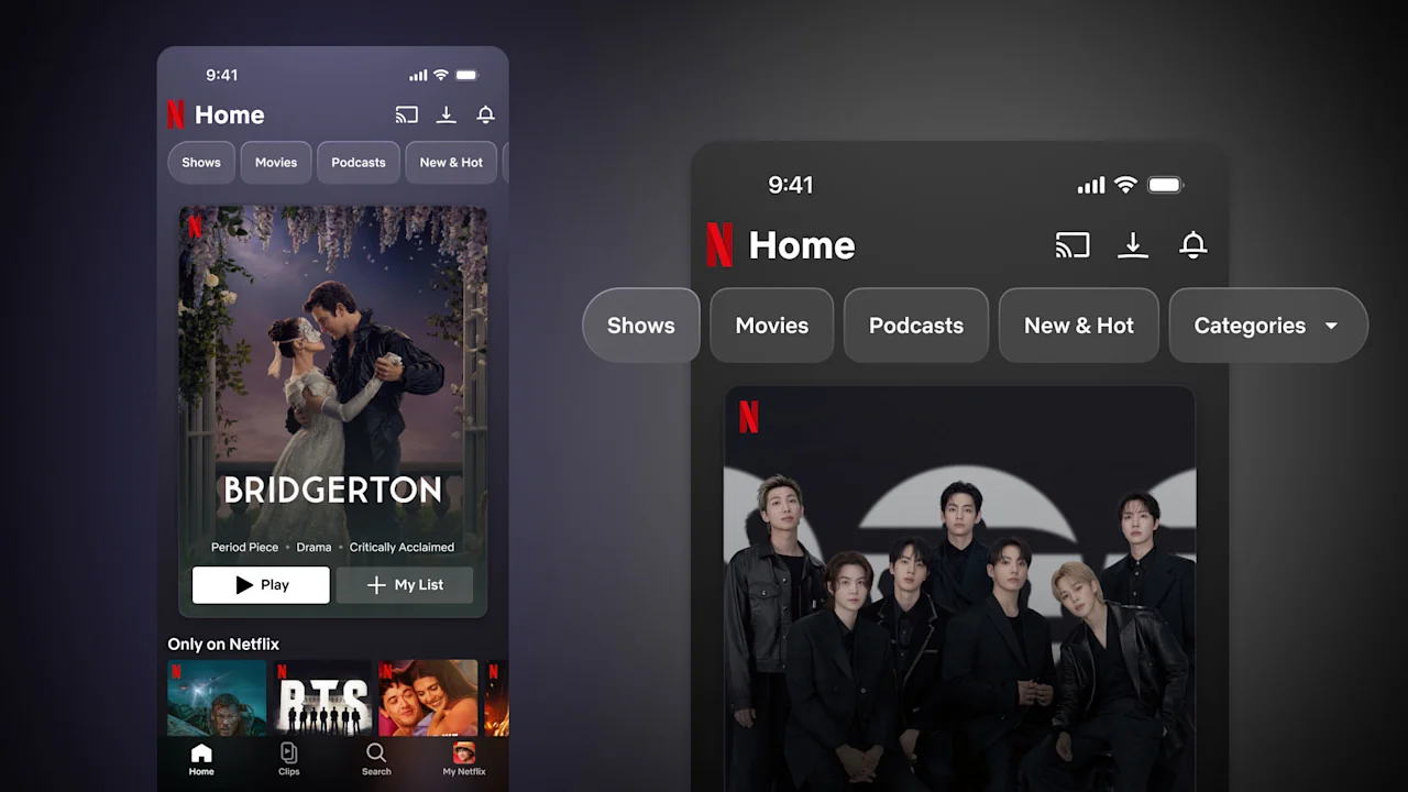
The next time you open Netflix’s app, it may look a lot more like You Tube, Instagram, or Tik Tok. That’s no accident: On April 29, the streaming service begins rolling out its biggest mobile redesign in years, with a major focus on vertical video. Netflix is launching the new mobile UI in the U.S., U.K., Canada, and a handful of other countries now, with plans to expand globally in the coming months. Once the app updates, subscribers will gain access to a new “Clips” tab featuring trailers, highlights, and behind-the-scenes footage from Netflix shows, movies, and podcasts, all optimized for quick, on-the-go viewing. Clips appear in an endless scroll feed, much like the experience on popular social apps. The redesign is a clear acknowledgment that the way people consume video, both on phones and TVs, is shifting. Netflix is also facing a growing field of competitors vying for viewers’ time, including YouTube, which now accounts for nearly 13% of all TV viewing time. Netflix’s answer is to bring the fight directly to YouTube’s and Instagram’s home turf: mobile phones. With vertical videos, Netflix puts podcasts front and center Media companies have long struggled to adapt to the rise of mobile-native video platforms like Instagram, TikTok, and YouTube. Case in point: Jeffrey Katzenberg’s Quibi raised $1.75 billion to create a Netflix for short-form vertical video, only to shut down six months post-launch after failing to attract viewers. Netflix aims to avoid those mistakes, and it’s not treating vertical video as an end in itself. While Quibi attempted to pioneer entirely new formats, and apps like Instagram are built to keep users scrolling indefinitely, Netflix’s Clips feed is focused on content discovery. Users can find a clip from a show they may enjoy, add it to their watch list, or rotate their phone and begin watching immediately. At its core, Netflix remains focused on long-form storytelling, which has not always translated easily to smaller screens. “Professi