5 ways the World Cup ticketing process is a complete design fail
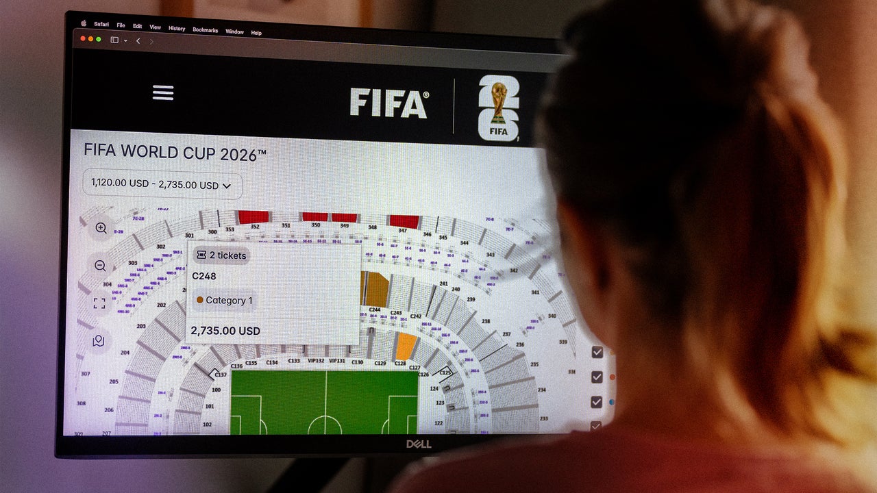
The ticketing system for the World Cup has been so bad that California, New York, New Jersey, and Texas are investigating FIFA over reports of issues like false advertising and sky-high prices. Good online ticketing UX prioritizes transparency and ease of use, but for the World Cup, users have complained the system is designed to maximize profit instead of serving fans. Here’s how. 1. The queue and long wait times To buy a World Cup ticket on Fifa’s website, fans first have to choose between three buttons on its home page, which read “last-minute sales,” “marketplace,” and “hospitality.” If you click on “last minute,” you’re taken to a page to complete a captcha, and then a waiting room where a clock counts down until you can enter the sales portal. On Wednesday it started at 23 minutes, though the time remaining sometimes changed. There’s only a five-minute window to enter, and if you miss it, you’ll have to get back into the queue. [Screenshot: FC] The friction doesn’t stop there. Once you make it through the queue, a user has the option to click linked text at the top of a pop-up window for hospitality packages (which are different than last-minute tickets, and also accessible via a button on the World Cup home page), or to click an “enter here” button at the bottom, which sends the user to a log-in page before providing access to last-minute tickets. Fans reported hours-long wait times, and tough luck to anyone who got engrossed in another tab while waiting without setting a timer. The friction adds a time cost in addition to the monetary cost of buying a ticket. After sitting through the countdown, fans might find themselves confused by multiple buttons to click, including a top link to hospitality packages, but clicking enter takes you to a sign-in page, adding more steps to the process. 2. Glitches and error messages The ticketing system was designed to block bots