Why Roku’s iconic home screen finally got a reboot
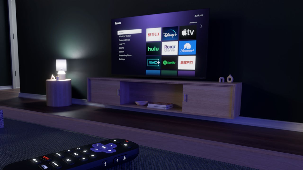
For the 100 million homes that currently use a Roku TV or streaming player, things are about to look a lot different. This week, Roku is rolling out a major redesign of its home screen, replacing the grid of static app tiles that has defined the platform for the past 13 years. The new design puts recommendations of movies and TV shows at the top of the screen and adds more direct links to Roku’s other menus, such as its Sports page and Live TV guide. The update will arrive in waves on Roku devices in the U.S., with testing to start in other markets later this year. “We wanted to craft a home screen that was more helpful, and I hope even occasionally delightful, while staying true to that simplicity that led people to choose Roku in the first place,” says Preston Smalley, Roku’s VP of product. For a company that tends to avoid drastic changes, this is a big one. But it’s also a key to Roku’s profitability, as it can lean on the new home screen to push more subscriptions and ad-supported TV. At the same time, it’s trying to solve a real problem for users: Navigating through a sea of app tiles can be a pain. The tension between those two desires—to connect users with what they’re trying to watch, and to upsell them on new things—is one that Roku will have to work even harder to balance now. Roku’s new look Roku is pretty much the last streaming platform to embrace a content-centric home screen. Amazon’s Fire TV, Google TV, Apple TV, Samsung TVs, LG TVs, and Vizio TVs have all been promoting content over apps for years. Still, Roku’s approaching it in a way that feels more Roku-like. Instead of endless rows of recommendations, the top of Roku’s new home screen has just a cluster. These tiles change over time based on your viewing habits, and you can hit the remote’s star button to approve or disapprove of them individually. Below that is a “Quick Access” panel that combines app suggestio